스크롤 부드럽게하는 snap
CSS의 snap 속성 사용해서 스크롤 부드럽게 해주기!
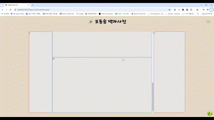
스크롤을 내릴 때 다음 컨테이너에 맞추고 싶다면 CSS만으로 해결해줄 수 있다.
snap을 사용해보면 좋다.
<div className="custom_suap_container">
  <section className="flex-shrink-0 h-full">
    <div className="custom_suap">
      <h1>제목1</h1>
      내용
    </div>
    <div className="custom_suap">
      <h1>제목2</h1>
      내용
    </div>
    <div className="custom_suap">
      <h1>제목3</h1>
      내용
    </div>
    <div className="custom_suap">
     <h1>제목4</h1>
      내용
    </div>
  </section>
</div>;
css는 다음과 같다.
.custom_suap_container {
  scroll-snap-type: y mandatory;
  display: flex;
  flex-direction: column;
  overflow-y: auto;
  overflow-x: hidden;
}

.custom_suap {
  scroll-snap-align: start;
  flex-grow: 1;
  width: 100%;
  height: 500px;
  border: 1px solid blue;
}
전체 컨테이너(제일 부모 컨테이너)에 scroll-snap-type: y mandatory;를 사용해서 해당 컨테이너에서 스크롤바로 조정할 수 있다.
그리고 자식 컨테이너에 scroll-snap-align: start; 를 사용하면 된다.